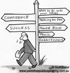
 In order to make your presentation effective, you need to know your audience. It won't be fair to either the presenter or the audience if both are not on the same page. As a presenter, you cannot waste any opportunity or your audience will be lost. You rather have the audience be engaged than sleeping. This means that as a presenter, you want to get the best goal from the audience. After you are prepared for the audience you’ll be speaking to, here are some other helpful tips in order to further your engagement with your audience:
• Be sure to know an interactive approach for a maximum impact.
• Be positive when it comes to reframing.
• Always be energetic when delivering a presentation.
• Find the specific needs of the audience instead of having “filler” information.
• Even though you want to be energetic, remember to stay relaxed as well.
• Natural humor is good to use, but don’t overdo it.
• Try to use personal examples in order for the audience to be able to relate.
With all of that said, I hope everyone now knows how to have effective presentations. I know that these tips are useful considering that I tend to get nervous during presentations. The big important tips from me are to be relaxed and positive.
1. “Effective Presentation Skills” http://www.sequenceweb.co.uk/page/effectivepresentation
2. “Six Elements of an Effective Presentation” http://www.ljlseminars.com/elements.htm
3. Nick Bland @ http://www.panicfreepublicspeaking.com.au/images/home_cartoon.jpg
Excellent post, it is very important to have complete interaction between the presenter and the audience. Great points!
ReplyDeleteGreat post! You did a really great job!!
ReplyDeleteI love that picture! Godd job!
ReplyDeletei meant good job! lol
ReplyDeleteGreat job! the picture really caught my attention, and the post had some great points!
ReplyDeleteVery creative photograph choice. The post is well written, and very informative. Overall, great job!
ReplyDeleteNice work!
ReplyDeletegood job and nice graphic and use of white space
ReplyDelete